Aug 26, 2026 Design Insights
7 Common Types of Logo Design
Explore seven common logo styles—from wordmarks and lettermarks to mascots and emblems—and learn how each design approach can express brand personality and improve recognition.
A logo is one of the most important visual elements of a brand. It helps customers recognize a company, understand its character, and remember its products.
Different logo styles communicate different feelings. Some look simple and professional, while others feel friendly, traditional, creative, or energetic.
Here are seven common types of logo design and the situations in which they may work best.
01. Wordmark Logo
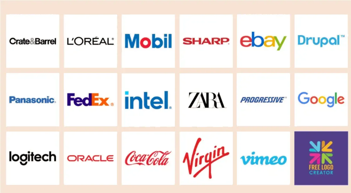
A wordmark logo is a powerful and highly recognizable logo style. It uses the complete name of a brand or company without additional symbols, icons, or illustrations.
The design mainly depends on the choice of typeface. Different fonts, sizes, styles, and colors can create different visual impressions. A brand selling outdoor products, such as trampolines or adventure equipment, may choose a bold and energetic typeface. A digital marketing company may prefer a clean and professional font.
Two of the most famous wordmark logos are Google, with its simple and colorful lettering, and Disney, with its decorative and distinctive type style.
Wordmark logos work best when the brand name is short, distinctive, and easy to remember.
02. Lettermark Logo
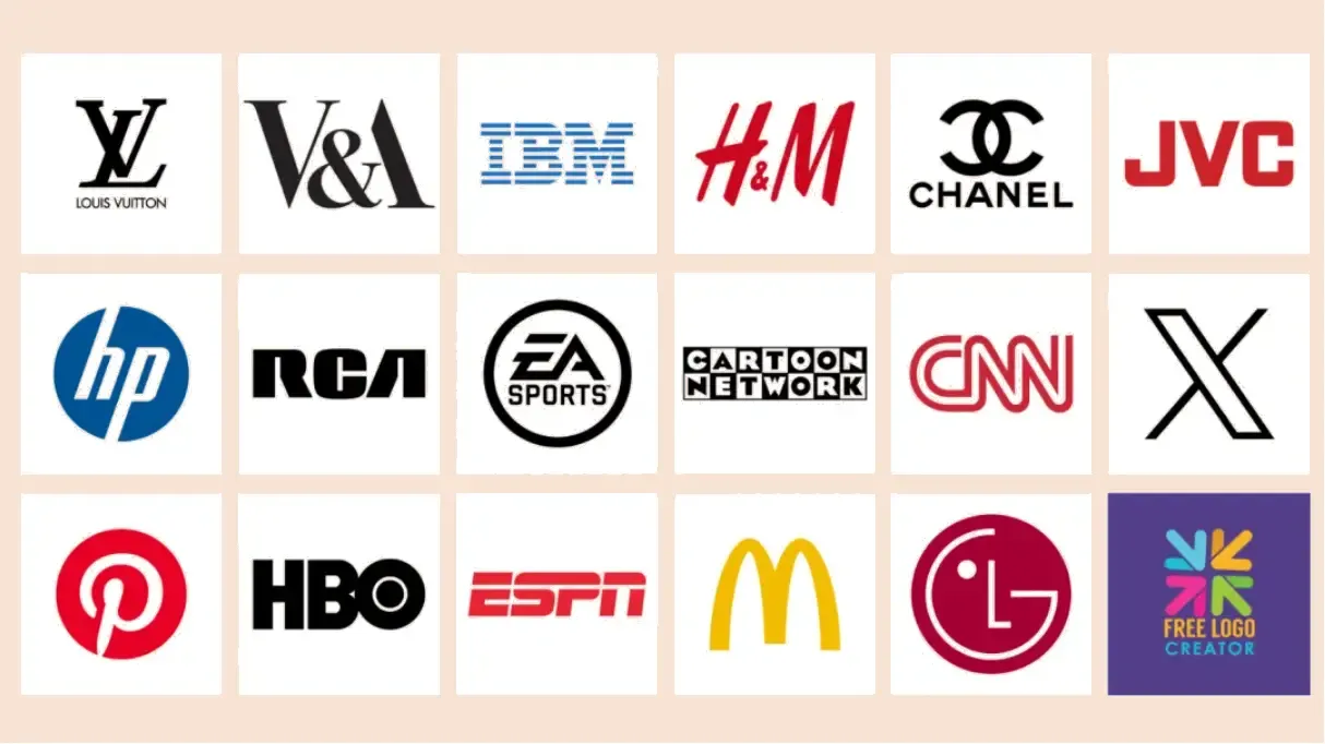
A lettermark logo, also called a monogram logo, uses the initials or abbreviation of a brand name.
You can explore different typefaces, sizes, styles, and colors to create a visual identity that fits the brand.
Examples include Louis Vuitton, represented by the initials LV, and Home Box Office, better known as HBO.
Lettermark logos are especially suitable for brands or companies with long names. They can make the identity shorter, cleaner, and easier to use.
03. Pictorial Mark
A pictorial mark is a simple symbol or image that represents the brand. The design is usually minimal and easy to recognize.
If you choose a pictorial mark, the symbol should reflect your brand and create a clear connection with your audience.
Apple’s bitten apple and Target’s simple bullseye are two well-known examples. Both logos use uncomplicated visual elements that are easy to remember.
A pictorial mark can be based on almost anything, including an object, an animal, or a simple icon, as long as it matches the brand’s values and positioning.
Pictorial marks are a strong choice for brands that want a clean, simple, and memorable visual identity.
04. Abstract Mark
An abstract logo uses creative shapes, lines, and colors to express a brand’s values or personality.
However, abstract logo design requires careful planning. Not every customer will understand the intended meaning immediately, so the visual strategy must be clear and consistent.
Today, many designers also use image-generation and design software to explore unique shapes, symbols, and color combinations during the early stages of development.
Airbnb’s logo, which represents people, places, love, and the letter A, is a well-known example. Nike’s famous swoosh is another simple but highly recognizable abstract mark.
Abstract marks are suitable for brands that want to express originality, creativity, and a unique point of view.
05. Mascot Logo
A mascot logo uses a character or figure with human-like features. Mascots often communicate friendliness, energy, and emotion.
They are especially suitable for brands targeting families and children because characters can create an immediate emotional connection with the audience.
However, a mascot may not be the best choice for a brand that wants to appear highly formal, serious, or corporate.
The Michelin Man is a classic example of a mascot logo. Reddit uses a small alien-like character, while the Playboy bunny is another simple and memorable character-based design.
A mascot can be based on almost anything, from a favorite animal to an everyday object.
Mascot logos are a good choice for brands that want to create a fun, friendly, and approachable image.
06. Combination Mark
As the name suggests, a combination mark brings together two or more logo styles. It may combine a wordmark with a symbol, a lettermark with an abstract shape, or an illustration with a brand name.
If one logo style does not fully express your brand, combining different elements can provide greater flexibility.
Examples include the Burger King logo, which combines burger-shaped graphics with the brand name, Dove’s logo with its dove symbol and wordmark, and the Nestlé logo with its bird’s nest image.
Combination marks can be adapted for different situations. The symbol may be used alone in some applications, while the full logo can be used when the brand name needs to be displayed clearly.
Combination marks offer more creative freedom, but they may not be suitable for brands that prefer an extremely minimalist identity.
07. Emblem Logo
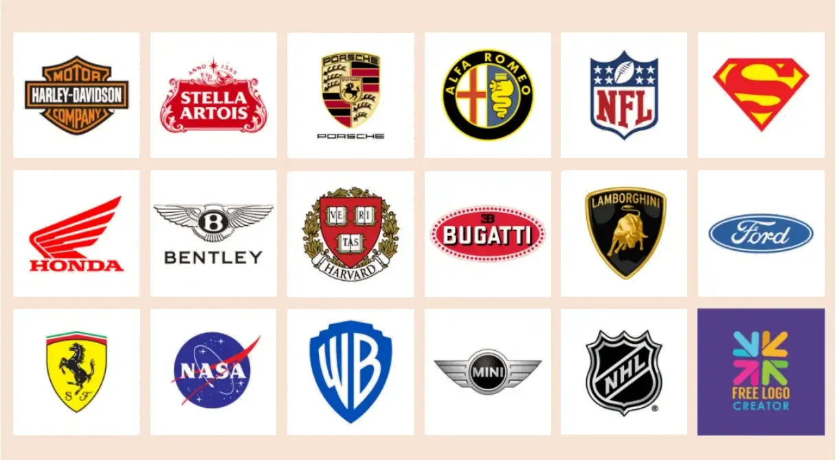
An emblem logo is similar to a traditional badge, seal, crest, or institutional mark. It usually places symbols and text inside a defined shape.
Emblem logos often contain more details and create a stronger sense of tradition, history, and heritage.
The Harley-Davidson logo, with its shield and framed structure, is a well-known example. The Superman logo, with a large letter S inside a shield, is another recognizable emblem design.
Emblem logos are best suited to brands that want to communicate tradition, culture, authority, and heritage.
How to Choose the Right Logo Style
There is no single logo style that is suitable for every brand. The right choice depends on your brand name, target audience, industry, personality, and future applications.
- Choose a wordmark when the brand name is short and distinctive.
- Choose a lettermark when the company name is long or difficult to remember.
- Choose a pictorial mark when you want a simple and recognizable symbol.
- Choose an abstract mark when originality and creativity are important.
- Choose a mascot when you want to appear friendly and approachable.
- Choose a combination mark when you need greater flexibility.
- Choose an emblem when tradition and heritage are central to the brand.
A good logo should not only look attractive. It should also be clear, easy to recognize, suitable for different sizes, and consistent across packaging, websites, labels, advertisements, and social media.
The most effective logo is not always the most complicated one. It is the design that communicates the brand clearly and remains memorable over time.